HTML bumpf: part III

a bit more Graphics

Complicated images with jillions of colours take a while to display ... especially if you have a slow modem or the website is crowded or ...

If you don't want to bore(?) your viewer you can display a simple image first, then the more complicated (and usually slower-to-load) one.

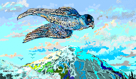
Suppose the complicated image is called falcon.gif

That's the one which looks like
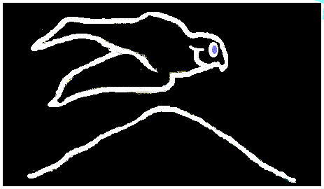
and the simple-minded image is called falcon_0.gif
That's the one which looks like
Normally to display the (complicated) image we'd just use something like:
<IMG SRC="images//falcon.gif">

Instead, to first display the LOW resolution image, then the complicated one, we use:
<IMG SRC="http-stuff/falcon.gif" LOWSRC="http-stuff/falcon_0.gif">

Simple, eh what?

P.S. I should mention that if there's text and an IMG on the same line the text won't be centered on the image:
Instead it'll look like this

instead of like this
Just use:
The text that's on the same line as <IMG ALIGN="middle" SRC="images/falcon_0.gif">

where the ALIGN HTML addition to the usual IMG tag is shown in FONT COLOR="#880000" (a dark red). Of course, you'll want to try ALIGN="top" or mebbe ALIGN="bottom" or mebbe ALIGN="absbottom" or mebbe ...

Backgrounds

To get a neat background, you start with a graphic which, in our example (called "images/notebook_sample.gif"), looks like this:

then you can create a TABLE with this graphic covering the entire interior of the table, using:

<TABLE BACKGROUND="images/notebook_sample.gif" CELLPADDING="30">
<TD>Put your text/graphics/etc. in here ...</TD>
</TABLE>

How's this for something neat?
Just be sure that your graphics is
plenty wide enough and you leave
enough CELLPADDING so any text ain't
covered by the graphic bumpf.

Of course, you can use any graphic ...
like Mr. "images/smile.gif"

Note:Your browser will fill the entire interior of your table with your graphic image. If you want just one image to fit across your table (like the "images/notebook_sample.gif"), be sure only one image will fit across! Play with the CELLPADDING, else you may get something like this:
Mamma mia! I used CELLPADDING="10" and it ain't hardly enuff ... so be sure to PLAY with it!

Click a Map

Here's a map of (some of) Europe. Move your mouse across the map. In certain regions it changes to a finger, meaning you could click and go ... somewhere. Go ahead! Click ... but come back, hear? Euler Newton Gauss Fermat Lagrangia
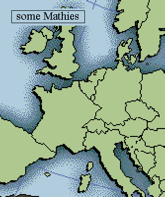
Here's the HTML which associates certain regions within the map with HREF links:
<MAP NAME="test_map">
<AREA SHAPE="RECT" COORDS="179,241,212,270" HREF="EULER.htm">
<AREA SHAPE="RECT" COORDS="110,110,160,160" HREF="NEWTON.htm">
<AREA SHAPE="RECT" COORDS="202,178,252,235" HREF="GAUSS.htm">
<AREA SHAPE="RECT" COORDS="99,199,165,265" HREF="FERMAT.htm">
<AREA SHAPE="RECT" COORDS="196,278,236,337" HREF="LAGRANGE.htm">
</MAP>

First we identify the MAP NAME, namely test_map. (You can verify that that's the name of the picture; just click on the picture with your right mouse button. It'll say the name is test_map.gif, meaning it's a .gif image, with the name test_map.)
Whereas MAP is the beginning of the HTML tag, you can guess what the ending is: </MAP>, as usual. (See it there?)

So what's in between <MAP> and </MAP>?
Five (count 'em) AREA SHAPEs, all of which are RECTangles. The pixel coordinates for the upper left corner are given for each RECTangle ... followed by the coordinates for the lower right corner. For example, 179,241,212,270 means the first rectangle goes from (179,241) at the upper left to (212,270) at the lower right. (I should point out that (179,241) means you start at the upper left corner of the test_map picture and move right 179 pixels then down 241 pixels and you arrive at the upper left of our first RECTangle. A similar journey, with numbers (212,270), would bring you to the lower right corner of that first RECTangle.

Anyway, we've defined these five RECTangles to coincide (sort of) with the pertinent countries on our map. When your cursor lies within any one of these RECTangles your browser arranges to have it change to a finger. Now, if you click, your browser will take you somewhere. Where? To the HREFerence given, namely to EULER.htm (if you click within the first RECTangle) or NEWTON.htm (if you click within the second RECTangle), etc. etc.

OOPS! I forgot to ask the browser to display the GRAPHIC test_map.gif, so we add to the above HTML the one additional line:

<IMG SRC="images/test_map.gif" USEMAP="#test_map">
where we've seen the IMG SRC="images/test_map.gif" stuff before -- it displays the test_map -- but now we also associate regions within this GRAPHIC via the previously defined MAP.

Altogether now:

<MAP NAME="test_map">
<AREA SHAPE="RECT" COORDS="179,241,212,270" HREF="EULER.htm">
<AREA SHAPE="RECT" COORDS="110,110,160,160" HREF="NEWTON.htm">
<AREA SHAPE="RECT" COORDS="202,178,252,235" HREF="GAUSS.htm">
<AREA SHAPE="RECT" COORDS="99,199,165,265" HREF="FERMAT.htm">
<AREA SHAPE="RECT" COORDS="196,278,236,337" HREF="LAGRANGE.htm">
</MAP>
<IMG SRC="images/test_map.gif" USEMAP="#test_map">
So, how do we obtain the coordinates (179,241,212,270) etc.?
In our case, we used a graphics program, PhotoSuite (tho' there are lots of others you could use). Having displayed the test_map.gif picture with the graphics program, we drag the mouse across some RECTangular region and the graphics program identifies the coordinates of the corners. Neat, eh what?

Uh ... did I mention music? Y'all kin use a Link to music, same as you would a link to a web page
... like, for example:
<A HREF="/over_the_rainbow.mid"> which opens an audio plug-in for your browser and plays ... uh, you can guess what it plays, no?
an HTML Overview

Wait!
Before you go on to "an HTML Overview" I should explain the layout of these HTML Tutorials.
  1. You first click into PART I , a file called HTML_Praxis.htm
  2. At the end of this there's a link which says to PART II, but it's actually a link to a FRAMESET file (HTML_framed.htm) which displays both PART I (that's HTML_Praxis.htm) on top and PART II (that's HTML_Praxis_2.htm) on the bottom.
  3. PART II (that's the HTML_Praxis_2.htm file) has a link at the bottom to PART III, but it's actually a link to a FRAMESET file (HTML_framed2.htm) which displays both PART II (that's HTML_Praxis_2.htm) on top and PART III (that's HTML_Praxis_3.htm) on the bottom.
  4. PART III (that's where we are now) has a link at the bottom to an HTML Overview, but it's actually a link to a FRAMESET file (HTML_Overview.htm) which displays a "menu" file called HTML_Praxis_menu.htm on top and PART IV (that's HTML_Praxis_4.htm) on the bottom.
      Uh ... it that confusing?
    Well, look at it this way, as sort of a Family Tree with links 'n stuff:

    ... to be continued (one-of-these-days ...)